5. Plotting and Visualization
This notebook example demonstrates how to create various plots using the visualization functions in MASSpy.
All visualization methods in MASSpy utilize matplotlib for creating and manipulating plots. Plots generated by MASSpy can be subjected to various matplotlib methods before and after generating the plot.
[1]:
import matplotlib as mpl
import matplotlib.pyplot as plt

import numpy as np

import pandas as pd

import mass.example_data
from mass import MassConfiguration, Simulation

mass_config = MassConfiguration()
mass_config.decimal_precision = 12  # Round after 12 digits after decimal
model = mass.example_data.create_example_model("Glycolysis")
Set parameter Username
5.1. Quickly Viewing Simulation Results
A simulation is performed with a perturbation in order to generate output to plot.
[2]:
simulation = Simulation(model, verbose=True)
simulation.find_steady_state(model, strategy="simulate",
                             decimal_precision=True)
conc_sol, flux_sol = simulation.simulate(
    model, time=(0, 1000),
    perturbations={"kf_ATPM": "kf_ATPM * 1.5"},
    decimal_precision=True)
Successfully loaded MassModel 'Glycolysis' into RoadRunner.
Simulation results can be quickly rendered into a time profile using the MassSolution.view_time_profile() method.
[3]:
conc_sol.view_time_profile()
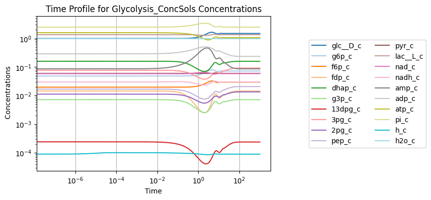
However, this method does not provide any flexibility or control over the plot that is generated. For more control over the plotting process, the various methods of the visualization submodule can be used.
5.2. Time Profiles
Time profiles of simulation results are created using the plot_time_profile() function.
[4]:
from mass.visualization.time_profiles import (
    plot_time_profile, get_time_profile_default_kwargs)
The minimal input required is a MassSolution object:
[5]:
plot_time_profile(conc_sol);
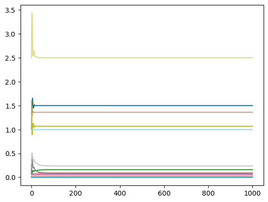
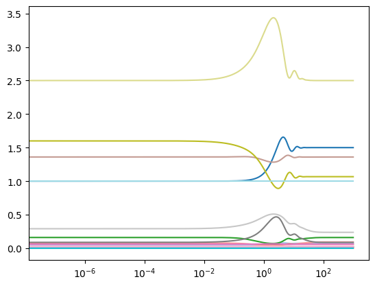
A linear x-axis and a linear y-axis are used by default. The plot_function kwarg is used to change the scale of the axes. For example, to view the plot with a linear x-axis and a logarithmic y-axis:
[6]:
plot_time_profile(conc_sol, plot_function="semilogx");
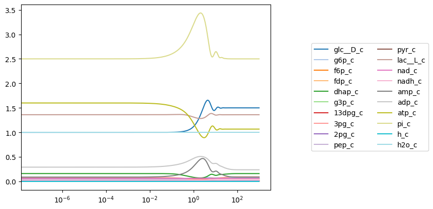
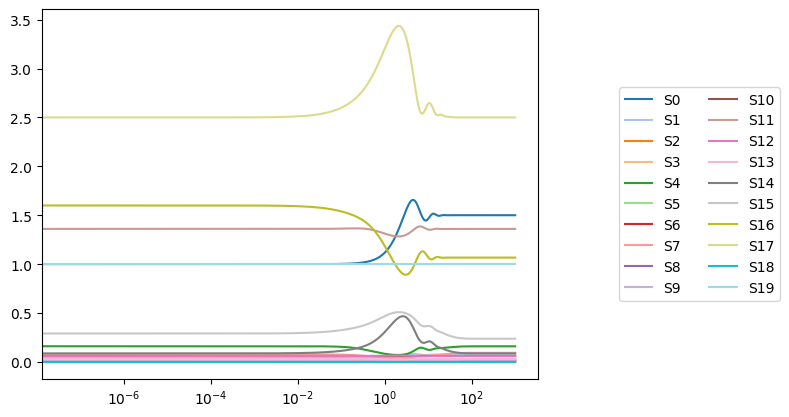
A legend can be added to the plot simply by passing a valid legend location to the legend argument (valid legend locations can be found here). Solution labels correspond to MassSolution keys.
[7]:
plot_time_profile(conc_sol, plot_function="semilogx",
                  legend="right outside");
Legend entries can be changed from their defaults by passing an iterable containing legend labels. The format must be (labels, location), and the number of labels must correspond to the number of new items being plotted.
[8]:
labels = ["S" + str(i) for i in range(len(conc_sol.keys()))]
plot_time_profile(conc_sol, plot_function="semilogx",
                  legend=(labels, "right outside"));
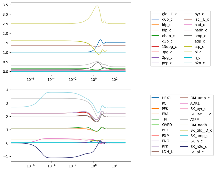
Whenever a plot is generated, the Axes containing the plot is returned by the plotting function. If a plot is created and no Axes object is provided, the most current Axes instance is used and returned.
An Axes instance for plotting can be provided to the ax argument, allowing for multiple plots to be placed on a single figure.
[9]:
fig, (ax1, ax2) = plt.subplots(nrows=2, ncols=1, figsize=(6, 8))

# Concentration solutions
plot_time_profile(
    conc_sol, ax=ax1, legend="right outside",
    plot_function="semilogx");

# Flux solutions
plot_time_profile(
    flux_sol, ax=ax2, legend="right outside",
    plot_function="semilogx");
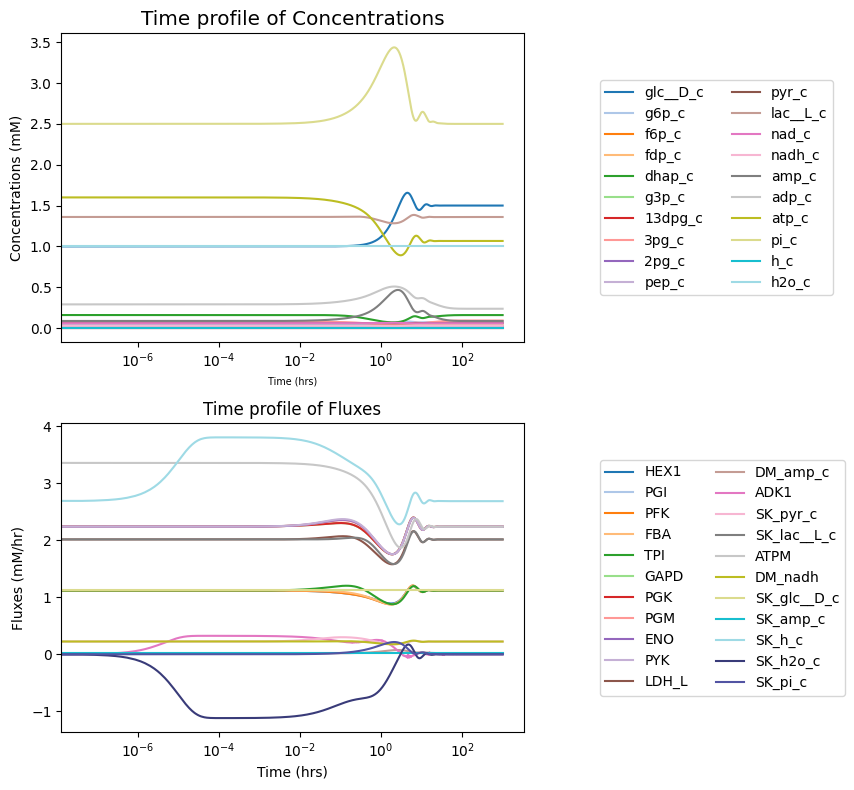
Axes labels and a title are set at the time of plotting using the xlabel, ylabel, and title kwargs. Each argument takes either a str for the label or a tuple that contains the label and a dict of font properties. The Figure.tight_layout() method is used to prevent overlapping labels.
[10]:
fig, (ax1, ax2) = plt.subplots(nrows=2, ncols=1, figsize=(9, 8))

# Concentration solutions
plot_time_profile(
    conc_sol, ax=ax1, legend="right outside",
    plot_function="semilogx",
    xlabel=("Time (hrs)", {"size": "x-small"}),
    ylabel=("Concentrations (mM)", {"size": "medium"}),
    title=("Time profile of Concentrations", {"size": "x-large"}));

# Flux solutions
plot_time_profile(
    flux_sol, ax=ax2, legend="right outside",
    plot_function="semilogx",
    xlabel="Time (hrs)",
    ylabel="Fluxes (mM/hr)",
    title="Time profile of Fluxes");
fig.tight_layout()
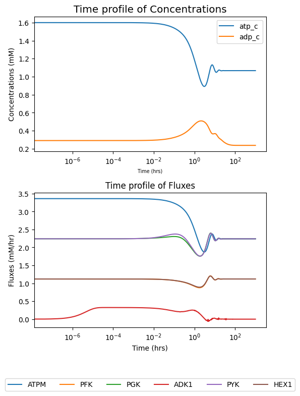
The observable argument is used to view a subset of solutions. The observable argument requires an iterable of strings or objects with identifiers that correspond to MassSolution keys. Both are shown below:
[11]:
fig, (ax1, ax2) = plt.subplots(nrows=2, ncols=1, figsize=(6, 8))

# Concentration solutions
plot_time_profile(
    conc_sol,
    observable=["atp_c", "adp_c"],  # Using strings
    ax=ax1, legend="best",
    plot_function="semilogx",
    xlabel=("Time (hrs)", {"size": "x-small"}),
    ylabel=("Concentrations (mM)", {"size": "medium"}),
    title=("Time profile of Concentrations", {"size": "x-large"}));

# Flux solutions
plot_time_profile(
    flux_sol,
    observable=list(model.metabolites.atp_c.reactions),  # Using objects
    ax=ax2, legend="lower outside",
    plot_function="semilogx",
    xlabel="Time (hrs)",
    ylabel="Fluxes (mM/hr)",
    title="Time profile of Fluxes",
    legend_ncol=6);
fig.tight_layout()
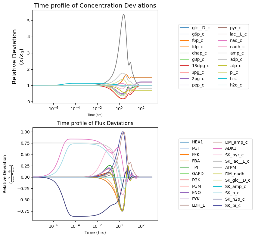
To view how solutions deviate from their initial value (i.e., MassModel.initial_conditions for concentrations and MassModel.steady_state_fluxes for fluxes), the deviation kwarg can be set as True.
[12]:
fig, (ax1, ax2) = plt.subplots(nrows=2, ncols=1, figsize=(9, 8))

# Concentration solutions
plot_time_profile(
    conc_sol, ax=ax1, legend="right outside",
    plot_function="semilogx",
    xlabel=("Time (hrs)", {"size": "x-small"}),
    ylabel=("Relative Deviation\n" + r"($x/x_{0}$)",
            {"size": "x-large"}),
    title=("Time profile of Concentration Deviations",
           {"size": "x-large"}),
    deviation=True,
    deviation_normalization="initial value" # divide by initial value
);

# Flux solutions
plot_time_profile(
    flux_sol,
    ax=ax2, legend="right outside",
    plot_function="semilogx",
    xlabel="Time (hrs)",
    ylabel=("Relative Deviation\n" +\
            r"($\frac{v - v_{0}}{v_{max} - v_{min}}$)"),
    title="Time profile of Flux Deviations",
    deviation=True,
    deviation_zero_centered=True,   # Center deviation around 0
    deviation_normalization="range" # divide by value range
);
fig.tight_layout()
All possible kwargs and their default values for functions of the mass.visualization.time_profiles submodule can be retrieved using the get_time_profile_default_kwargs() function:
[13]:
sorted(get_time_profile_default_kwargs(
    function_name="plot_time_profile"))
[13]:
['annotate_time_points',
 'annotate_time_points_color',
 'annotate_time_points_labels',
 'annotate_time_points_legend',
 'annotate_time_points_marker',
 'annotate_time_points_markersize',
 'annotate_time_points_zorder',
 'color',
 'deviation',
 'deviation_normalization',
 'deviation_zero_centered',
 'grid',
 'grid_color',
 'grid_linestyle',
 'grid_linewidth',
 'legend_ncol',
 'linestyle',
 'linewidth',
 'marker',
 'markersize',
 'plot_function',
 'prop_cycle',
 'time_vector',
 'title',
 'xlabel',
 'xlim',
 'xmargin',
 'ylabel',
 'ylim',
 'ymargin',
 'zorder']
See the visualization submodule documentation for more information on possible kwargs.
5.3. Phase Portraits
To plot phase portraits of dynamic responses against each other, use the plot_phase_portrait() function.
[14]:
from mass.visualization.phase_portraits import (
    plot_tiled_phase_portraits, plot_phase_portrait,
    get_phase_portrait_default_kwargs)
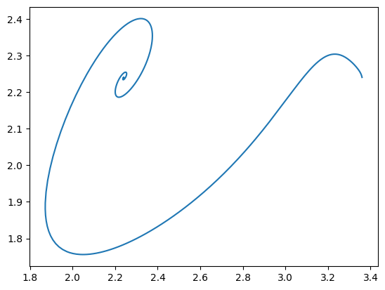
The minimal input for a phase portrait includes a MassSolution object and two solution keys.
[15]:
plot_phase_portrait(
    flux_sol,
    x="ATPM",  # Using a string
    y=model.reactions.GAPD,  # Using an object
);
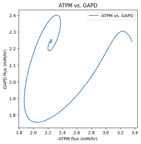
As with time profiles, the plot_phase_portrait() function has an ax argument that takes an Axes instance and a legend argument for legend labels and position. A title and axes labels also can be placed on the plot.
[16]:
fig, ax = plt.subplots(nrows=1, ncols=1, figsize=(5, 5))
plot_phase_portrait(
    flux_sol, x="ATPM", y="GAPD", ax=ax, legend="best",
    xlabel="ATPM flux (mM/hr)", ylabel="GAPD flux (mM/hr)",
    title=("ATPM vs. GAPD", {"size": "large"}));
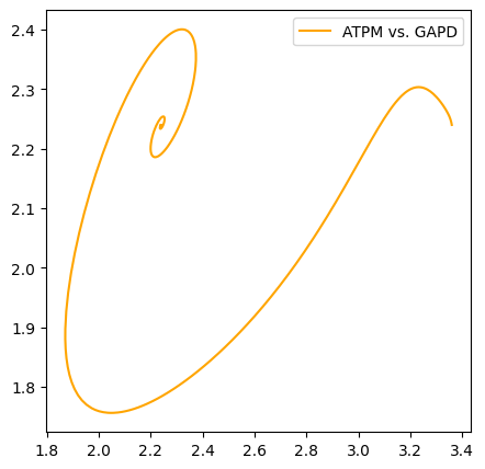
The color and linestyle kwargs are used to set the line color and style.
[17]:
fig, ax = plt.subplots(nrows=1, ncols=1, figsize=(5, 5))
plot_phase_portrait(
    flux_sol, x="ATPM", y="GAPD", ax=ax, legend="best",
    color="orange", linestyle="-");
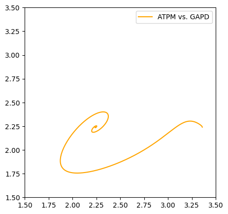
Axes limits are set using the xlim and ylim arguments with tuples of format (minimum, maximum).
[18]:
fig, ax = plt.subplots(nrows=1, ncols=1, figsize=(5, 5))
plot_phase_portrait(
    flux_sol, x="ATPM", y="GAPD", ax=ax, legend="best",
    color="orange", linestyle="-",
    xlim=(1.5, 3.5), ylim=(1.5, 3.5));
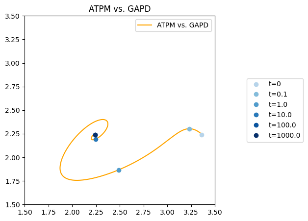
To call out a particular time point in the solution, the annotate_time_points kwarg is used with a list of time points to annotate. There are kwargs, such as annotate_time_points_color and annotate_time_points_legend, that allow for some customization of the annotated time points.
[19]:
fig, ax = plt.subplots(nrows=1, ncols=1, figsize=(5, 5))

# Createt time points and colors for the time points
time_points = [0, 1e-1, 1e0, 1e1, 1e2, 1e3]
time_point_colors = [
    mpl.colors.to_hex(c)
    for c in mpl.cm.Blues(np.linspace(0.3, 1, len(time_points)))]

# Plot the phase portrait
plot_phase_portrait(
    flux_sol, x="ATPM", y="GAPD", ax=ax, legend="upper right",
    xlim=(1.5, 3.5), ylim=(1.5, 3.5),
    title="ATPM vs. GAPD",
    color="orange", linestyle="-",
    annotate_time_points=time_points,
    annotate_time_points_color=time_point_colors,
    annotate_time_points_legend="right outside");
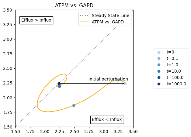
Because all figures are generated using matplotlib, additional lines can be plotted, and annotations can be placed on the plot using various matplotlib methods.
[20]:
fig, ax = plt.subplots(nrows=1, ncols=1, figsize=(5, 5))

# Plot a line representing steady state
ax.plot([1.5, 3.5], [1.5, 3.5], label="Steady State Line",
        color="grey", linestyle=":")

# Plot the phase portrait
plot_phase_portrait(
    flux_sol, x="ATPM", y="GAPD", ax=ax, legend="upper right",
    xlim=(1.5, 3.5), ylim=(1.5, 3.5),
    title="ATPM vs. GAPD",
    color="orange", linestyle="-",
    annotate_time_points=time_points,
    annotate_time_points_color=time_point_colors,
    annotate_time_points_legend="right outside");

# Annotate arrow for initial perturbation
xy = (flux_sol["ATPM"][0],
      flux_sol["GAPD"][0])
xytext = (model.reactions.get_by_id("ATPM").steady_state_flux,
          model.reactions.get_by_id("GAPD").steady_state_flux)
ax.annotate("", xy=xy,
            xytext=xytext, textcoords="data",
            arrowprops=dict(arrowstyle="->", connectionstyle="arc3"));
# Add arrow label
ax.annotate(
    "initial perturbation", xy=xy, xytext=(-120, 10),
    textcoords="offset pixels");
# Add text about the behavior on each side of the steady state line
ax.annotate(
    "Efflux < Influx", xy=(0.65, 0.05), xycoords="axes fraction",
    bbox=dict(fc="white", ec="black"));
ax.annotate(
    "Efflux > Influx", xy=(0.05, 0.9), xycoords="axes fraction",
    bbox=dict(fc="white", ec="black"));
All possible kwargs and their default values for the functions of the mass.visualization.phase_portraits submodule can be retrieved using the get_phase_portrait_default_kwargs() function:
[21]:
sorted(get_phase_portrait_default_kwargs(
    function_name="plot_phase_portrait"))
[21]:
['annotate_time_points',
 'annotate_time_points_color',
 'annotate_time_points_labels',
 'annotate_time_points_legend',
 'annotate_time_points_marker',
 'annotate_time_points_markersize',
 'annotate_time_points_zorder',
 'color',
 'deviation',
 'deviation_normalization',
 'deviation_zero_centered',
 'grid',
 'grid_color',
 'grid_linestyle',
 'grid_linewidth',
 'legend_ncol',
 'linestyle',
 'linewidth',
 'marker',
 'markersize',
 'plot_function',
 'prop_cycle',
 'time_vector',
 'title',
 'xlabel',
 'xlim',
 'xmargin',
 'ylabel',
 'ylim',
 'ymargin',
 'zorder']
See the visualization submodule documentation for more information on possible kwargs.
5.4. Plotting Comparisons
To compare two sets of data in MASSpy, use the plot_comparison() function.
[22]:
from mass.visualization.comparison import (
    plot_comparison, get_comparison_default_kwargs)

model_2 = mass.example_data.create_example_model("textbook")
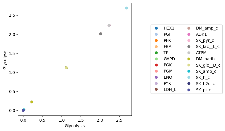
The plot_comparison() function requires two objects and a string that indicates what to compare. For example, to compare the steady state fluxes between two MassModel objects:
[23]:
fig, ax = plt.subplots(nrows=1, ncols=1, figsize=(5, 5))

plot_comparison(
    x=model, y=model, compare="fluxes",
    ax=ax, legend="right outside",
    plot_function="plot",
    xlabel=model.id, ylabel=model.id);
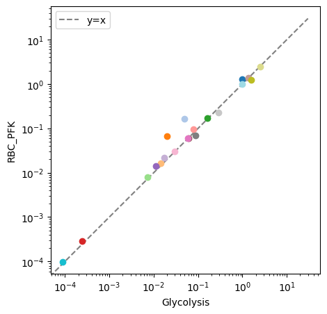
By providing an iterable of object identifiers to the observable argument, the plotted results are filtered, which is especially useful when comparing the similar variables in different objects. The xy_line kwarg is used to add a “perfect” fit line to the visualization. For example, to compare concentrations of two different models, each containing glycolytic species:
[24]:
fig, ax = plt.subplots(nrows=1, ncols=1, figsize=(5, 5))

# Plot species from glycolysis model only
plot_comparison(
    x=model, y=model_2, compare="concentrations",
    observable=[m.id for m in model.metabolites],
    ax=ax, legend="right outside",
    plot_function="loglog",
    xlabel=model.id, ylabel=model_2.id,
    xy_line=True, xy_legend="best");
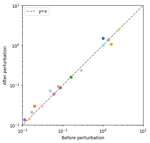
The plot_comparison() function compares different objects to one another as long as the compare argument is given an appropriate value. In the following example, a pandas.Series, containing steady state concentrations of the model after an ATP utilization perturbation, is compared to model concentrations before the perturbation.
[25]:
fig, ax = plt.subplots(nrows=1, ncols=1, figsize=(5, 5))

# Create a pandas.Series to compare to the model steady state fluxes
flux_series = pd.Series(conc_sol.to_frame().iloc[-1, :])

# Compare the pandas.Series to the model steady state fluxes
# Plot species from glycolysis model only
plot_comparison(
    x=model, y=flux_series, compare="concentrations",
    ax=ax, legend="right outside",
    plot_function="loglog",
    xlabel="Before perturbation", ylabel="After perturbation",
    xlim=(1e-2, 1e1), ylim=(1e-2, 1e1),
    xy_line=True, xy_legend="best");
All possible kwargs and their default values for the functions of the mass.visualization.comparison submodule can be retrieved using the get_comparison_default_kwargs() function:
[26]:
sorted(get_comparison_default_kwargs(
    function_name="plot_comparison"))
[26]:
['color',
 'grid',
 'grid_color',
 'grid_linestyle',
 'grid_linewidth',
 'legend_ncol',
 'marker',
 'markersize',
 'plot_function',
 'prop_cycle',
 'title',
 'xlabel',
 'xlim',
 'xmargin',
 'xy_legend',
 'xy_line',
 'xy_linecolor',
 'xy_linestyle',
 'xy_linewidth',
 'ylabel',
 'ylim',
 'ymargin']
See the visualization submodule documentation for more information on possible kwargs.
5.5. Additional Examples
For additional examples of detailed visualizations using MASSpy, see the following: